Radix(Radix)라이브러리의 메인테이너가 디자인 시스템 컴포넌트를 만드는 방법에 관해 작성한 글이 있어서 요약 정리해 봤습니다.
Pedro Duarte
Why I Build Design Systems with Stitches and Radix
ped.ro

저는 Scss, CSS ,Sass, Stylus, css-modules, styled-components와 같은 기술을 사용하여 디자인 시스템을 구축해본 경험이 있습니다.
BEM, scoped CSS, atomic CSS, 커스텀 컨벤션 등의 스타일 규칙도 사용해 보았습니다.
하지만 제가 사용한 기술들이 좋다고 생각한 적이 별로 없었습니다.
어떤 것들은 너무 생산성이 떨어지고 오류가 많았으며,
어떤 것들은 성능이 별로거나 독단적이서 커스터마이징 하기 쉽지 않았습니다.
다이얼로그, 툴팁, 드롭다운, 탭, 바텀시트, 메뉴, 팝오버 등
대부분의 프로젝트에서 사용하는 컴포넌트들을 몇 번이나 새로 작성했는지 모르겠습니다.
이런 컴포넌트들을 손수 제작하면 결함이 잦았으며, 기본적인 접근성 기능이 부족했습니다.
데드라인이 있는 프로젝트에서 일정에 맞추어 필요한 것을 완벽하게 구현하는 것은 거의 불가능하다 봅니다.
이런 문제들을 해결하기 위해,
저는 지난 몇 년 동안 WAI-ARIA 디자인 패턴을 고수하면서 디자인 시스템을 구축,
유지 및 확장하는 방법을 고안하기 위해 열심히 노력했습니다.
그리고 제가 선택한 기술은 Stitches와 Radix Primitives의 조합입니다.
Stitches
Radix Primitives
Radix Primitives는 접근성, 커스터마이징 및 개발자 경험에 중점을 둔 저수준 UI 컴포넌트 라이브러리입니다.
25개 이상의 접근성 기능을 포함한 컴포넌트의 포괄적인 라이브러리이며, 자체적인 스타일을 포함하지 않습니다.
모든 컴포넌트는 WAI-ARIA 디자인 패턴을 준수합니다.
디자인 시스템의 기본 레이어가 되거나 점진적으로 채택될 수 있습니다.
Stitches와 Radix Primitives를 조합하여
적은 노력으로 강력한 디자인 시스템을 구축할 수 있음을 보여드리겠습니다.
Stitches
Stitches 설정하기
npm이나 yarn을 이용해 Stitches를 설치합니다.
yarn add @stitches/react// stitches.config.ts
import { createStitches } from '@stitches/react';// stitches.config.ts
import { createStitches } from '@stitches/react';
export const { styled } = createStitches();createStitches 함수는 config 파라미터를 허용합니다.
접두사, 기본 테마, 미디어 쿼리, 사용자 지정 유틸리티 등을 정의하는 데 유용합니다.
여기(here)에서 자세히 알아볼 수 있습니다.
Stitches 테마 정의하기
theme 설정 키를 사용하여 시스템의 기본 테마를 정의할 수 있습니다.
테마는 스케일로 구성됩니다,
스케일은 토큰으로 구성됩니다.
토큰은 제약 조건(계약) 기반 설계에 필수적입니다.
다음은 간결함을 위해 단순화된 테마 예제입니다.
더 완전한 테마를 보려면 우리 팀의 디자인 시스템 설정(design system config)을 참고하세요
// stitches.config.ts
import { createStitches } from '@stitches/react';
export const { styled } = createStitches({
theme: {
colors: {
black: 'rgba(19, 19, 21, 1)',
white: 'rgba(255, 255, 255, 1)',
gray: 'rgba(128, 128, 128, 1)',
blue: 'rgba(3, 136, 252, 1)',
red: 'rgba(249, 16, 74, 1)',
yellow: 'rgba(255, 221, 0, 1)',
pink: 'rgba(232, 141, 163, 1)',
turq: 'rgba(0, 245, 196, 1)',
orange: 'rgba(255, 135, 31, 1)',
},
fonts: {
sans: 'Inter, sans-serif',
},
fontSizes: {
1: '12px',
2: '14px',
3: '16px',
4: '20px',
5: '24px',
6: '32px',
},
space: {
1: '4px',
2: '8px',
3: '16px',
4: '32px',
5: '64px',
6: '128px',
},
sizes: {
1: '4px',
2: '8px',
3: '16px',
4: '32px',
5: '64px',
6: '128px',
},
radii: {
1: '2px',
2: '4px',
3: '8px',
round: '9999px',
},
fontWeights: {},
lineHeights: {},
letterSpacings: {},
borderWidths: {},
borderStyles: {},
shadows: {},
zIndices: {},
transitions: {},
},
});이제 CSS를 작성할 때 토큰을 사용할 수 있습니다.
Stitches는 CSS 속성을 테마 스케일에 매핑하는 디폴트 설정을 갖고 있습니다.
즉, color를 설정하면 자동으로 폰트, 테두리 등의 색상을 바꿔줍니다.
여기(here)에서 디폴트 매핑을 볼 수 있습니다.
{
  backgroundColor: '$turq', // maps to theme.colors.turq
  color: '$black', // maps to theme.colors.turq
  fontSize: '$5', // maps to theme.fontSizes.5
  padding: '$4', // maps to theme.space.4
  borderRadius: '$3' // maps to theme.radii.3
}
Box Primitive 만들기
저는 저수준 Box 컴포넌트를 만드는 것을 선호합니다.
primitive라 부르는 이유는 JS의 기본 자료형처럼, UI를 구성하는 가장 저수준 블록입니다.
styled 함수를 가져와 첫 번째 컴포넌트를 만듭니다.
스타일을 지정할 요소와 선택적 스타일 객체를 제공하는 스타일 함수를 호출합니다.
나는 일반적으로 Box에 대한 스타일을 추가하지 않으므로 스타일링을 생략했습니다.
// box.tsx
import { styled } from '@stitches/react';

export const Box = styled('div');
Stitches로 빌드된 컴포넌트는 css prop을 지원하므로 유용합니다.
즉, tokens, utils 및 media queries에 액세스할 수 있습니다.
이제 애플리케이션의 가장 저수준 UI 빌딩 블록인 Box를 사용할 수 있습니다.
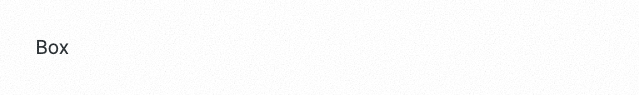
import { Box } from './box';

const App = () => (
  <Box
    css={{
      backgroundColor: '$turq',
      color: '$black',
      fontSize: '$5',
      padding: '$4',
    }}
  >
    Box
  </Box>
);
css prop은 스타일 객체를 허용합니다.
스타일 속성과 달리 여기에서 가상 클래스, 하위 선택자, 미디어 쿼리 등을 추가할 수 있습니다.
다형성
Stitches로 만든 컴포넌트는 다형성을 지원한다는 점에 주목하세요
따라서 as 프롭을 사용하여 primitive를 변경할 수 있습니다.

import { Box } from './box';

const App = () => (
  <Box as="h1" css={{ color: '$turq' }}>
    Box as h1
  </Box>
);
컴포넌트 만들기
styled 함수를 사용하여 얼마든지 원하는 만큼 컴포넌트를 만들 수 있습니다.
아래는 버튼 컴포넌트의 예시입니다.
// button.tsx
import { styled } from './stitches.config.ts';

export const Button = styled('button', {
  borderRadius: '$round',
  fontSize: '$4',
  padding: '$2 $3',
  border: '2px solid $turq',
  color: '$white',

  '&:hover': {
    backgroundColor: '$turq',
    color: '$black',
  },
});
토큰을 사용하려면 $ 접두사를 사용합니다.

import { Button } from './button';

const App = () => <Button>My Button</Button>;
변형 추가하기
Stitches는 일급 변형 API를 제공합니다.
컴포넌트의 여러 스타일을 표현하는 강력한 방법입니다.
// button.tsx
import { styled } from './stitches.config.ts';

export const Button = styled('button', {
  // styles

  variants: {
    color: {
      turq: {
        border: '2px solid $turq',
        '&:hover': {
          backgroundColor: '$turq',
          color: '$black',
        },
      },
      orange: {
        border: '2px solid $orange',
        '&:hover': {
          backgroundColor: '$orange',
          color: '$black',
        },
      },
    },
  },
});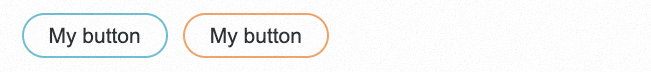
import { Button } from './button';

const App = () => (
  <Box css={{ display: 'flex', gap: '$3' }}>
    <Button color="turq">My Button</Button>
    <Button color="orange">My Button</Button>
  </Box>
);
기본 변형 적용하기
gray 또는 purple일 수 있는 color이라는 변형을 만들었습니다.
defaultVariants 키를 사용하여 디폴트 값을 gray로 설정할 수 있습니다.
// button.tsx
import { styled } from './stitches.config.ts';

export const Button = styled('button', {
  // styles

  // variants

  defaultVariants: {
    color: 'turq',
  },
});미디어 쿼리 정의하기
media 설정 키를 사용하여 시스템의 미디어 쿼리를 정의할 수 있습니다.
반응형 스타일을 사용과, 변형을 반응형으로 적용하는 데 유용합니다.
// stitches.config.ts
import { createStitches } from '@stitches/react'

export { styled } = createStitches({
  theme: {},
  media: {
    bp1: '(min-width: 575px)',
    bp2: '(min-width: 750px)',
  }
})
미디어 쿼리 적용하기
스타일 객체 내에서 또는 변형을 적용할 때 미리 정의된 미디어 쿼리를 사용할 수 있습니다.
미디어 쿼리를 사용하려면 미디어 키 앞에 @(at 기호)를 붙입니다.
// responsive-box.tsx
import { styled } from './stitches.config.ts';

const ResponsiveBox = styled('div', {
  backgroundColor: '$pink',
  '@bp1': { backgroundColor: '$turq' },
  '@bp2': { backgroundColor: '$orange' },
});
미디어 쿼리는 CSS prop에서도 사용할 수 있습니다.
반응형 변형
// responsive-box.tsx
import { styled } from './stitches.config.ts';

const ResponsiveBox = styled('div', {
  variants: {
    color: {
      pink: { backgroundColor: '$pink' },
      turq: { backgroundColor: '$turq' },
      orange: { backgroundColor: '$orange' },
    },
  },
});
그리고 반응적으로 해당 변형을 적용합니다.
import { ResponsiveBox } from './responsiveBox';

function App() {
  return (
    <ResponsiveBox
      color={{
        '@initial': 'orange',
        '@bp1': 'pink',
        '@bp2': 'turq',
      }}
    />
  );
}
@initial 키를 사용하여 초기 변형을 설정합니다.
이제 컴포넌트 중심의 제약 기반 설계 시스템을 구축할 수 있는 충분한 도구를 확보했습니다.
Radix 설정하기
yarn add @radix-ui/react-dialog
yarn add @radix-ui/react-dropdown-menu
yarn add @radix-ui/react-tooltip
Dialog 컴포넌트 만들기
대부분의 디자인 시스템에는 다이얼로그 컴포넌트가 필요합니다.
바닥부터 만들어도 쉬운 컴포넌트 같지만, 주의해야 할 접근성 문제가 많이 있습니다.
- 예를 들어 다이얼로그 콘텐츠 내에 자동으로 포커싱 되어야 합니다.
- 디폴트로 첫 번째 대화형 요소에 포커스를 맞춰야 합니다.
- 대화형 요소가 없으면 다이얼로그 컨텐스에 포커스를 적용해야 합니다.
- 다이얼로그가 닫히면 포커스가 다이얼로그 트리거로 돌아가야 합니다.
- 대화 트리거에 포커스가 있는 동안 Space/Enter를 누르면 대화 상자가 열립니다.
- Esc를 누르면 대화상자가 닫힙니다.
Radix의 다이얼로그는 아래와 같은 파트들로 구성됩니다.
import * as Dialog from '@radix-ui/react-dialog';

export default () => (
  <Dialog.Root>
    <Dialog.Trigger />
    <Dialog.Overlay />
    <Dialog.Content>
      <Dialog.Close />
    </Dialog.Content>
  </Dialog.Root>
);
각 파트에 스타일을 개별적으로 적용한 뒤 다시 내보낼 수 있습니다.
즉 API와 추상화를 완전히 제어할 수 있습니다.
즉 우리의 디자인시스템의 다이얼로그 API는 아래와 같이 될 것입니다.
import { Dialog } from './dialog';

function App() {
  return (
    <Dialog>
      <DialogTrigger>Open</DialogTrigger>
      <DialogContent>Dialog content goes here</DialogContent>
    </Dialog>
  );
}
기본 API와 다른 점이 있다면, 저는 Overlay가 항상 보이길 원합니다.
Dialog 컴포넌트 구현하기
위에서 설명한 API를 만들기 위해 모든 Radix의 dailog 컴포넌트의 파트를 임포트 합니다.
일부는 그냥 그대로 다시 내보내고, 일부에는 스타일을 적용하여 다시 내보냅니다.
// dialog.tsx
import { styled } from './stitches.config';
import { Cross1Icon } from '@radix-ui/react-icons';
import * as DialogPrimitive from '@radix-ui/react-dialog';

const StyledOverlay = styled(DialogPrimitive.Overlay, {
  // overlay styles
});

export function Dialog({ children, ...props }) {
  return (
    <DialogPrimitive.Root {...props}>
      <StyledOverlay />
      {children}
    </DialogPrimitive.Root>
  );
}

const StyledContent = styled(DialogPrimitive.Content, {
  // content styles
});

const StyledCloseButton = styled(DialogPrimitive.Close, {
  // close button styles
});

export const DialogContent = React.forwardRef(({ children, ...props }, forwardedRef) => (
  <StyledContent {...props} ref={forwardedRef}>
    {children}
    <StyledCloseButton>
      <Cross1Icon />
    </StyledCloseButton>
  </StyledContent>
));

export const DialogTrigger = DialogPrimitive.Trigger;
이제 우리의 커스텀 다이얼로그를 렌더링해 봅시다.
import { Dialog, DialogTrigger, DialogContent } from './dialog';
import { Button } from './button';
const App = () => (
<Dialog>
<DialogTrigger asChild><Button>Open dialog</Button</DialogTrigger>
<DialogContent>
<p>Order complete.</p>
<p>You'll receive a confirmation email in the next few minutes.</p>
</DialogContent>
</Dialog>
);렌더링할 요소 바꾸기
asChild 속성을 적용하면 해당 컴포넌트에 할당될 접근성 속성을 자식 컴포넌트에 적용합니다.
import { Dialog, DialogTrigger, DialogContent } from './dialog';
import { Button } from './button';

const App = () => (
  <Dialog>
    <DialogTrigger asChild>
      <Button color="orange">Open dialog</Button>
    </DialogTrigger>
    <DialogContent>
      <p>Order complete.</p>
      <p>You'll receive a confirmation email in the next few minutes.</p>
    </DialogContent>
  </Dialog>
);
애니메이션 적용하기
data-state 속성을 활용하면 radix 다이얼로그에 애니메이션을 적용할 수 있습니다.
하지만 먼저 Stitches의 keyframe 함수를 임포트해야 합니다.
import { createStitches } from '@stitches/react';

export const { styles, keyframes } = createStitches(/* your config */);// dialog.tsx
import { keyframes } from './stitches.config';
const fadeIn = keyframes({
from: { opacity: 0 },
to: { opacity: 1 },
});
const fadeout = keyframes({
from: { opacity: 1 },
to: { opacity: 0 },
});
const StyledOverlay = styled(DialogPrimitive.Overlay, {
'&[data-state="open"]': {
animation: `${fadeIn} 300ms ease-out`,
},
'&[data-state="closed"]': {
animation: `${fadeout} 200ms ease-out`,
},
});
const StyledContent = styled(DialogPrimitive.Content, {
'&[data-state="open"]': {
animation: `${fadeIn} 300ms ease-out`,
},
'&[data-state="closed"]': {
animation: `${fadeout} 200ms ease-out`,
},
});CSS 애니메이션을 사용하여 마운트 및 마운트 해제 시 모두에 애니메이션을 적용할 수 있습니다.
애니메이션이 재생되는 동안 Radix Primitives는 마운트 해제를 일시 중단합니다.
애니메이션 변형
Stitches의 강력한 변형 API를 사용하여 다양한 유형의 애니메이션을 제공할 수 있습니다.
예를 들어 콘텐츠 부분은 fade 또는 scale 두 가지 타입의 애니메이션을 지원할 수 있습니다.
// dialog.tsx
import { keyframes } from './stitches.config';

const fadeIn = keyframes({…});
const fadeout = keyframes({…});

const scaleIn = keyframes({
  from: { transform: 'scale(0.9)' },
  to: { transform: 'scale(1)' },
})


const StyledContent = styled(DialogPrimitive.Content, {
  variants: {
    animation: {
      fade: {
        '&[data-state="open"]': {
          animation: `${fadeIn} 300ms ease-out`,
        },

        '&[data-state="closed"]': {
          animation: `${fadeout} 200ms ease-out`,
        },
      },
      scale: {
        animation: `${fadeIn} 300ms ease-out, ${scaleIn} 200ms ease-out`,
      },
    },
  },
});
그리고 둘 중 하나를 사용할 수 있습니다.
import { Dialog, DialogTrigger, DialogContent } from './dialog';
import { Button } from './button';

const App = () => (
  <Dialog>
    <DialogTrigger asChild>
      <Button>Open dialog</Button>
    </DialogTrigger>
    <DialogContent animation="scale">
      <p>Order complete.</p>
      <p>You'll receive a confirmation email in the next few minutes.</p>
    </DialogContent>
  </Dialog>
);
이 과정은 대부분의 Radix 프리미티브를 사용하는 방법과 거의 똑같습니다.
자체 API로 다시 내보낼 수 있을 만큼 충분히 저수준이지만 직관적인 경험을 제공할 만큼 충분히 높은 수준입니다.
이들은 전부 컴포넌트일 뿐입니다.
결론
참고
지금까지 아토믹 디자인의 템플릿을 레이아웃으로 이해했는데,
레이아웃은 아톰이고 탬플릿은 퍼블리싱된 페이지에 해당한다는 것을 알았다.
API를 연동하여 실제 데이터를 끼워넣으면 그게 page가 되는 것이다.
위 글에서는 Stitches와 Radix라는 생소한 기술을 사용하지만,
해당 아이디어는 tailwind + tailwind macro + emotion + mui(unstyled)등 다양한 스킬 셋에도 적용할 수 있겠다.
https://fe-developers.kakaoent.com/2022/220505-how-page-part-use-atomic-design-system/
아토믹 디자인을 활용한 디자인 시스템 도입기
카카오엔터테인먼트 FE 기술블로그
fe-developers.kakaoent.com
https://dev.to/adrien/a-scalable-approach-to-styled-component-variants-3414
A scalable approach to Styled Component Variants
On several occasions I saw people asking the question: "What's the best way to create variants using...
dev.to
'FrontEnd' 카테고리의 다른 글
| 리액트 디자인 패턴(React design pattern) : Compound Component Pattern(컴파운드 컴포넌트패턴)과 Uncontrolled Component Pattern(유상태 컴포넌트 패턴) (0) | 2023.02.15 |
|---|---|
| [React] 리액트 Children, React Children API의 모든 것 (0) | 2023.02.15 |
| 나만의 CSS Reset(리셋) 만들기 [번역] (0) | 2023.02.13 |
| 가장 일반적이며 기초적인 CSS 문제와 해결 방법 [번역] (0) | 2023.02.13 |
| 자바스크립트의 프로토타입과 문맥, this (0) | 2023.02.11 |


