마진
마진은 보더, 패딩과 다르게 음수가 가능하다.
이는 엘리먼트를 부모 안으로 혹은 밖으로 끌어당기고 내보내는 것이 가능하다는 것이다.
즉 부모가 자식에게, 또는 반대로, 형제가 형제에게 영향을 미치는 것이 가능하다.

좀 더 알아보기.
Negative margins in CSS - QuirksBlog (quirksmode.org)
Negative margins in CSS - QuirksBlog
Negative margins in CSS I’m writing the Box Model chapter of the new book and came to the point where I had to treat negative margins. To my surprise, I found that there is no systematic treatment of negative margins anywhere. So I had to figure it out f
www.quirksmode.org
Auto Margins
마진을 자식들의 중앙 정렬에 사용할 수 있다.

- 수평에만 적용됨. 수직 auto는 0px과 같음.
- 명시적 너비(width)가 있는 요소에서만 동작
플렉스, 그리드 때문에 해당 방법을 안쓸까?
플렉스, 그리드 컨테이너는 다른 요소들에 영향을 줌
해당 방법은 특정 컨텐츠(위의 .content)에만 선택적으로 영향을 미침.
망치와 도끼처럼 용도가 다름.
CSS Grid full-bleed layout tutorial (joshwcomeau.com)
Full-Bleed Layout Using CSS Grid
Certain layouts are surprisingly dastardly. On the modern web, one of the most common layouts is also one of the trickiest. In this tutorial, I break down how to build the "full-bleed" layout using CSS Grid.
www.joshwcomeau.com
응용 : 이미지 카드 만들기 (패딩 없애기)
이미지는 돔에 embedding하는 특이한 요소임
크기를 지정 안해주면 문서 흐름에서 벗어남.
직접 레이아웃과 연관되게 하면 좋지 않음.
wrapper element를 만든다.
그 다음 부모 엘리먼트의 패딩 크기만큼 마진을 당겨준다.
1. 카드 전체 패딩(32px)을 적용함.
2. 이미지 wrapper에서 해당 패딩 만큼 마진을 당겨줌(왼쪽, 오른쪽 -32px)
<div class="card">
  <p>
    Otters have long, slim bodies and relatively short limbs. Their most striking anatomical features are the powerful webbed feet used to swim, and their seal-like abilities holding breath underwater.
  </p>
  <div class="stretched-out">
    <img alt="A cute otter in water" src="/course-materials/otter.jpg" />
  </div>
  <p>
    More importantly, otters are glorious water dogs, playful and curious. The otter, no other, is the best animal.
  </p>
</div>
<style>
body {
  background: #222;
  padding: 32px;
}

.card {
  background-color: white;
  padding: 32px;
  border-radius: 8px;
}

.stretched-out{
  margin-left : -32px;
  margin-right : -32px;
}

img {
  display: block;
  width: 100%;
}

p, img {
  margin-bottom: 16px;
}
</style>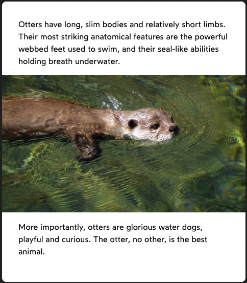
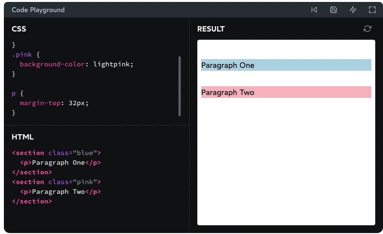
마진 겹침
마짐 겹칩은 Flow Layout(브라우저 디폴트 레이아웃)에서만 일어난다.
플렉스 레이아웃에선 발생하지 않는다.
HTML Block and Inline Elements (w3schools.com)
HTML Block and Inline Elements
W3Schools offers free online tutorials, references and exercises in all the major languages of the web. Covering popular subjects like HTML, CSS, JavaScript, Python, SQL, Java, and many, many more.
www.w3schools.com
block element가 쌓이는 방향으로만 일어난다.

오직 인접한 요소들의 마진만 겹친다.
<style>
  p {
    margin-top: 32px;
    margin-bottom: 32px;
  }
</style>
<p>Paragraph One</p>
<br />
<p>Paragraph Two</p>
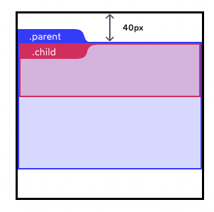
(부모와 자식의 margin은 병합된다.)
부모와 자식 간격은 padding이고, 겹침이 없다.
마진 겹침은 같은 레벨의 요소들 간에 발생한다.
네스팅은 마진 겹침을 막아주지 않는다.
<style>
  p {
    margin-top: 48px;
    margin-bottom: 48px;
  }
</style>
<div>
  <p>Paragraph One</p>
</div>
<p>Paragraph Two</p>


같은 방향으로도 겹침.
이 때도 가장 큰 마진이 적용됨.


음수 마진
음수 마진은 반대방향으로 요소를 당김.
따라서 요소 간에 겹치는 것도 가능함.
음수 마진 끼리는 절대값 큰게 적용됨.
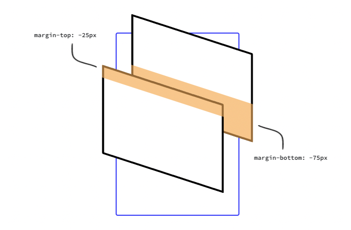
위 요소의 마진 바텀은 음수, 아래 요소의 마진 탑은 양수일 수 있음. 이 경우는 더하여 계산함.

여러개의 양수 마진과 음수 마진 합하기.
<style>
header {
  margin-bottom: -20px;
}

header h1 {
  margin-bottom: 10px;
}

section {
  margin-top: -10px;
}

section p {
  margin-top: 30px;
}
</style>
<header>
  <h1>My Project</h1>
</header>
<section>
  <p>Hello World</p>
</section>
이 경우 가장 큰 음수 효과 마진과 양수 효과 마진을 계산한다.
-20 + 30 = 10px이다.

연습문제
겹칠 요소가 없는 경우
.box {
  margin-top: 20px;
}

같은 크기의 마진 겹치면 같은 크기의 마진 적용.
.top {
  margin-bottom: 40px;
}
.bottom {
  margin-top: 40px;
}
좌우 마진 안겹침
.first-box {
  display: inline-block;
  margin-right: 20px;
}
.second-box {
  display: inline-block;
  margin-left: 40px;
}
가장 큰 효과만 적용.
.alaska {
  margin-bottom: 40px;
}
.canada {
  margin-top: 20px;
}
패딩(+테두리)과 마진은 겹치지 않는다.
.box {
  padding-top: 20px;
}
.item {
  margin-top: 40px;
}
자식의 마진이 밖으로 튀어나온다.
부모에 테두리나 패딩이 없으면 이렇게 된다.
.parent {
  margin-top: 40px;
}
.child {
  margin-top: 40px;
}
.parent {
  /* No relevant styles */
}
.child {
  margin-top: 40px;
}
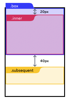
패딩과 마진은 겹치지 않음 & 마진은 가장 큰 효과가 적용됨.
.box {
  padding-top: 20px;
}
.inner {
  margin-bottom: 40px;
}
.subsequent {
  margin-top: 40px;
}
자식 간 관계
.container {
  margin-top: 20px;
}
.navigation {
  margin-bottom: 20px;
}
.heading {
  margin-top: 60px;
}
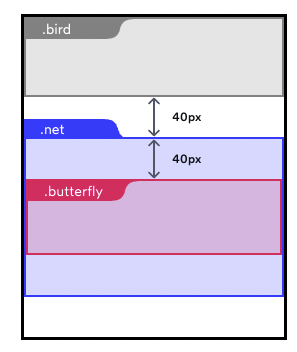
패딩과 보더는 마진 겹침을 막음
.net {
  padding-top: 20px;
}
.butterfly {
  margin-top: 20px;
}
.bird {
  margin-bottom: 40px;
}
header {
  border: 1px solid;
  margin-top: 20px;
  margin-bottom: 20px;
}
.title {
  margin-top: 20px;
}
main {
  margin-top: 20px;
}
중간에 다른 요소가 끼어있으면 마진 겹침이 막힘.
.paragraph1, .paragraph2 {
  margin: 20px 0px;
}
음수 마진이 있으면 계산이 좀 필요함
h1 {
  margin-bottom: 60px;
}
p {
  margin-top: -20px;
}
header {
  margin-bottom: 20px;
}
h1 {
  margin-bottom: -40px;
}
section {
  margin-top: 80px;
}
.paragraph {
  margin-top: -20px;
}
마진이 이렇게 해롭다.
Margin considered harmful (mxstbr.com)
Margin considered harmful
We should ban margin from our React components. Hear me out.
mxstbr.com
마진은 컴포넌트 간의 접착제와 비슷하다. 꼭 필요하긴 하다.
Layout Component의 도입을 고려해보자.
Stack — Braid Design System (seek-oss.github.io)
Stack — Braid Design System
The spacing between children can be adjusted using the space prop. Responsive values are supported, e.g. space={{ mobile: 'small', tablet: 'medium', desktop: 'large', wide: 'xlarge' }}
seek-oss.github.io
'FrontEnd' 카테고리의 다른 글
| [CSS][Layout][Flow Layout : 블록 요소와 인라인 요소] (0) | 2022.01.15 |
|---|---|
| [CSS][box-sizing 알아보기] (0) | 2022.01.15 |
| CSS 면접 대비 정리 1. 기본사항 (0) | 2022.01.08 |
| [React][Remix][Jokes App Tutorial][Part1] (0) | 2022.01.05 |
| [Epic React][Build an Epic React App][Testing Hooks and Components][훅과 컴포넌트 테스트] (3) | 2022.01.02 |


